> ## Documentation Index
> Fetch the complete documentation index at: https://docs.inco.org/llms.txt
> Use this file to discover all available pages before exploring further.
# Widgets & UI reference
> Drop in a confidential wallet or compose your own views and primitives.
[Open the live playground](https://ctoken-tze4f72wfa-ew.a.run.app/) to try each component and copy its setup.
 ## Ready-made widgets
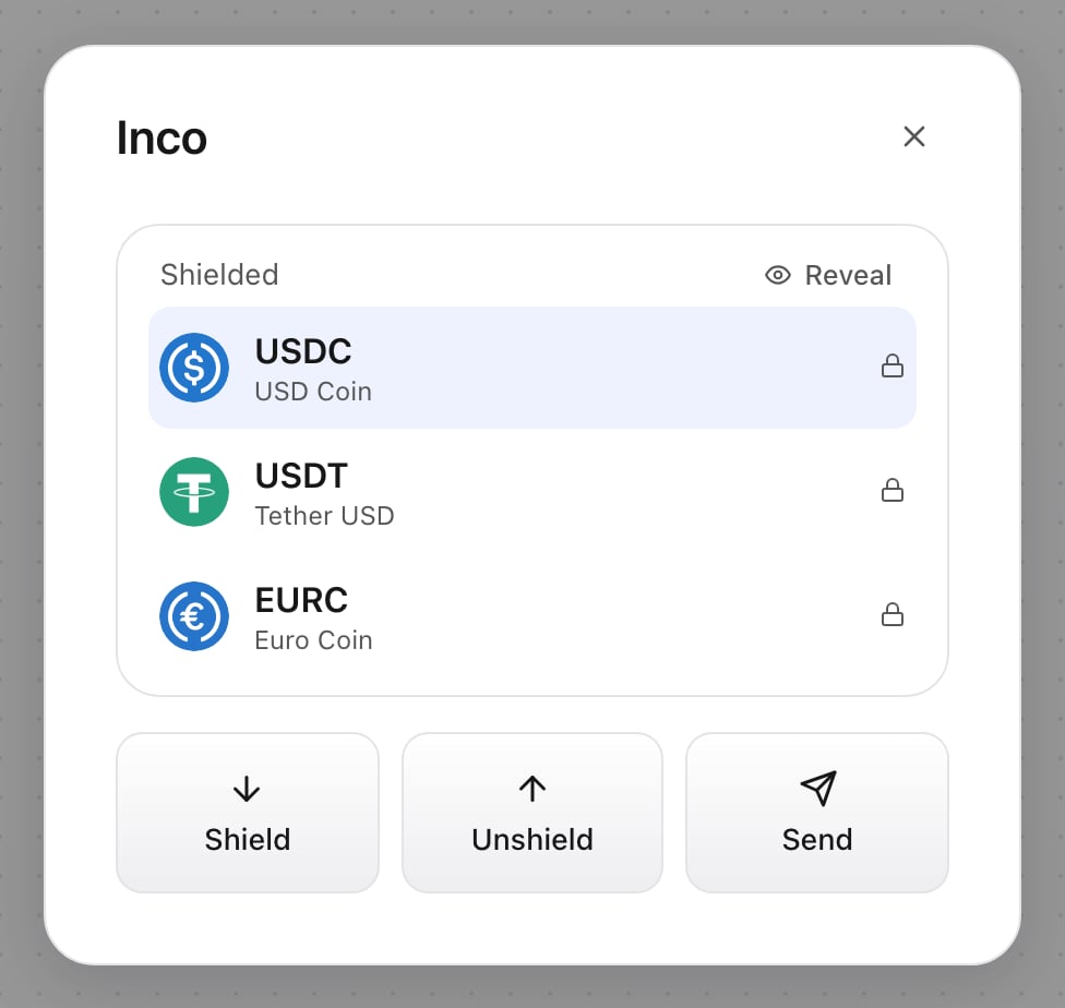
Import `@inco/ctoken/ui/styles.css` once and mount widgets inside the [React providers](/ctoken/react). Client components inherit your HSL theme variables.
```tsx theme={null}
import {
ConfidentialWallet, DepositWidget, SendWidget, WithdrawWidget,
BalanceCard, HistoryList,
} from "@inco/ctoken/ui";
```
| Component | Required props | Optional props / behavior |
| -------------------- | --------------------------- | ------------------------------------------------------------------------------------------------------------------------------------------------ |
| `ConfidentialWallet` | None beyond provider | `tokens`, `token`, `symbol`, `maxVisibleTokens`, `discoverTokens`, and trigger props. Portfolio + shield/send/unshield/activity/token selection. |
| `DepositWidget` | None if provider has tokens | `tokens`, `token`, `symbol`, `onSuccess(hash)`, trigger props. Opens shielding flow. |
| `SendWidget` | None if provider has tokens | Same action props; confidential send. |
| `WithdrawWidget` | None if provider has tokens | Same action props; unshield to owner. |
| `BalanceCard` | `token` | `symbol` defaults to `token`; hidden until reveal. |
| `PortfolioCard` | `tokens` | `selected`, `onSelect`, `maxVisible`, `discover`, `onDiscovered`, `onShowAll`, controlled `revealed`, `onToggleReveal`. |
| `HistoryList` | None | `address`, `limit`, `pollMs`. `limit` controls page size; polling is off by default. |
`TriggerProps`: `trigger?: ReactNode`, `triggerLabel?: ReactNode`, `triggerClassName?: string`. Transaction callbacks belong on action widgets/views; `ConfidentialWallet` has no `onSuccess`.
With indexing enabled, discovery defaults on and appends holdings after configured tokens. For controlled reveal, pair `revealed` with `onToggleReveal`.
## Action and navigation views
| Export | Props / purpose |
| ---------------------------------------- | ---------------------------------------------------------------------------------------------------------------------------------------------------------------------------------------------- |
| `ShieldView`, `SendView`, `UnshieldView` | `ViewProps`: required `token`; optional `symbol`, `icon`, `onSuccess(hash)`, `onDone()`, `onChangeToken()`, `onBusyChange(busy)`. |
| `HomeView` | Required `tokens`, `selected: TokenConfig`, `onSelect(address)`, `onNavigate(view)`; optional `maxVisibleTokens`, `discoverTokens`, `onDiscovered`, `onShowAll`, `revealed`, `onToggleReveal`. |
| `HistoryView` | Optional `address`, `pageSize`, `pollMs`. Includes pagination and reveal controls. |
| `TokenSelectView` | Required `tokens`, `onSelect(address)`; optional `selected`, `showBalances`, `balanceKind` (`public` or `shielded`), `revealed`, `onToggleReveal`. |
| `AnimatedView` | Required `viewKey` and children; optional `direction`, default 1. Transition wrapper respecting reduced motion. |
`WalletView`: `home`, `shield`, `unshield`, `send`, `history`, `select`. Use `onBusyChange` to prevent modal dismissal during operations.
## Display and modal primitives
| Export | Props / behavior |
| --------------------- | ----------------------------------------------------------------------------------------------------------------------------------------------------------------------------- |
| `Modal` | Required `open`, `onClose`, children. Optional `title`, `onBack`, `footer`, `dismissDisabled`. Portal dialog with focus trap, escape/overlay dismissal and focus restoration. |
| `DeploymentOverrides` | No props. Displays only active factory/vault/verifier values different from network defaults. Included in wallet and transaction modals. |
| `TokenPicker` | `tokens`, `selected`, `onSelect(address)`. |
| `TokenIcon` | `symbol`; optional `icon`, `seed`, `size`. Falls back to a generated avatar if an icon is unavailable. |
| `TokenCard` | `symbol`; optional `icon`, `seed`, `meta`, `action`, `onChangeToken`. |
| `ShieldedTokenCard` | `token`, `symbol`; optional `icon`, `onMax(decimalString)`, `onChangeToken`. |
| `PublicBalance` | `token`, `symbol`; optional `onMax(decimalString)`. |
| `ShieldedBalance` | `token`, `symbol`; optional `onMax(decimalString)`. |
| `FormError` | Optional string/null children; renders form feedback. |
Keep Max’s exact decimal string unchanged in state and pass it as `amount`.
```tsx theme={null}
const [amount, setAmount] = useState("");
setAmount(event.target.value)} />
```
## Ready-made widgets
Import `@inco/ctoken/ui/styles.css` once and mount widgets inside the [React providers](/ctoken/react). Client components inherit your HSL theme variables.
```tsx theme={null}
import {
ConfidentialWallet, DepositWidget, SendWidget, WithdrawWidget,
BalanceCard, HistoryList,
} from "@inco/ctoken/ui";
```
| Component | Required props | Optional props / behavior |
| -------------------- | --------------------------- | ------------------------------------------------------------------------------------------------------------------------------------------------ |
| `ConfidentialWallet` | None beyond provider | `tokens`, `token`, `symbol`, `maxVisibleTokens`, `discoverTokens`, and trigger props. Portfolio + shield/send/unshield/activity/token selection. |
| `DepositWidget` | None if provider has tokens | `tokens`, `token`, `symbol`, `onSuccess(hash)`, trigger props. Opens shielding flow. |
| `SendWidget` | None if provider has tokens | Same action props; confidential send. |
| `WithdrawWidget` | None if provider has tokens | Same action props; unshield to owner. |
| `BalanceCard` | `token` | `symbol` defaults to `token`; hidden until reveal. |
| `PortfolioCard` | `tokens` | `selected`, `onSelect`, `maxVisible`, `discover`, `onDiscovered`, `onShowAll`, controlled `revealed`, `onToggleReveal`. |
| `HistoryList` | None | `address`, `limit`, `pollMs`. `limit` controls page size; polling is off by default. |
`TriggerProps`: `trigger?: ReactNode`, `triggerLabel?: ReactNode`, `triggerClassName?: string`. Transaction callbacks belong on action widgets/views; `ConfidentialWallet` has no `onSuccess`.
With indexing enabled, discovery defaults on and appends holdings after configured tokens. For controlled reveal, pair `revealed` with `onToggleReveal`.
## Action and navigation views
| Export | Props / purpose |
| ---------------------------------------- | ---------------------------------------------------------------------------------------------------------------------------------------------------------------------------------------------- |
| `ShieldView`, `SendView`, `UnshieldView` | `ViewProps`: required `token`; optional `symbol`, `icon`, `onSuccess(hash)`, `onDone()`, `onChangeToken()`, `onBusyChange(busy)`. |
| `HomeView` | Required `tokens`, `selected: TokenConfig`, `onSelect(address)`, `onNavigate(view)`; optional `maxVisibleTokens`, `discoverTokens`, `onDiscovered`, `onShowAll`, `revealed`, `onToggleReveal`. |
| `HistoryView` | Optional `address`, `pageSize`, `pollMs`. Includes pagination and reveal controls. |
| `TokenSelectView` | Required `tokens`, `onSelect(address)`; optional `selected`, `showBalances`, `balanceKind` (`public` or `shielded`), `revealed`, `onToggleReveal`. |
| `AnimatedView` | Required `viewKey` and children; optional `direction`, default 1. Transition wrapper respecting reduced motion. |
`WalletView`: `home`, `shield`, `unshield`, `send`, `history`, `select`. Use `onBusyChange` to prevent modal dismissal during operations.
## Display and modal primitives
| Export | Props / behavior |
| --------------------- | ----------------------------------------------------------------------------------------------------------------------------------------------------------------------------- |
| `Modal` | Required `open`, `onClose`, children. Optional `title`, `onBack`, `footer`, `dismissDisabled`. Portal dialog with focus trap, escape/overlay dismissal and focus restoration. |
| `DeploymentOverrides` | No props. Displays only active factory/vault/verifier values different from network defaults. Included in wallet and transaction modals. |
| `TokenPicker` | `tokens`, `selected`, `onSelect(address)`. |
| `TokenIcon` | `symbol`; optional `icon`, `seed`, `size`. Falls back to a generated avatar if an icon is unavailable. |
| `TokenCard` | `symbol`; optional `icon`, `seed`, `meta`, `action`, `onChangeToken`. |
| `ShieldedTokenCard` | `token`, `symbol`; optional `icon`, `onMax(decimalString)`, `onChangeToken`. |
| `PublicBalance` | `token`, `symbol`; optional `onMax(decimalString)`. |
| `ShieldedBalance` | `token`, `symbol`; optional `onMax(decimalString)`. |
| `FormError` | Optional string/null children; renders form feedback. |
Keep Max’s exact decimal string unchanged in state and pass it as `amount`.
```tsx theme={null}
const [amount, setAmount] = useState("");
setAmount(event.target.value)} />
```